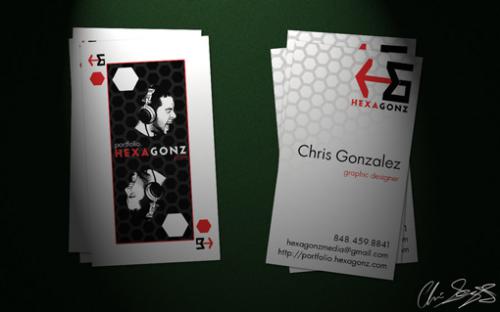
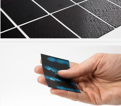
Business cards are a constant point of creativity for designers. This little personalized piece of marketing holds an impressive amount of potential for capturing the attention of potential customers and many businesses are willing to spend plenty of money to make sure their cards make a lasting statement.
Today we’ve collected over fifty business card designs and concepts that not only have aesthetic appeal, but really go that extra mile to increase impact. Some pop up into 3D shapes, others glow in the dark or even serve a lasting useful purpose. All of them are sure to inspire you in your own endeavors to create amazing business cards.
3D and Folded
The card designs below have been separated into several categories. The first of these, 3D and folded, is perhaps the most impressive. These intrepid designers weren’t satisfied with keeping their ideas in two-dimensions, they had to break out of the box to create in-your-face cards that are sure to impress.
This crazy designer left the outside of the card completely blank. It’s only when you squeeze the card and have a look inside that you discover the hidden information.
These can’t be easy to fold, but the end product is definitely pretty awesome. You just can’t beat a ninja throwing star business card.
At first, a folding business card didn’t seem very practical or appropriate to me. But then I realized that it’s a restaurant business card designed to look like a menu! Now that’s clever.
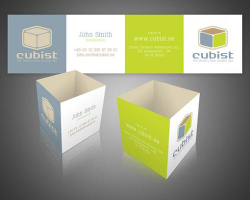
The first of many cube-inspired designs. These are quite popular and become more elaborate and impressive further down the list.
This one is just awesome. I’m sure it took no small amount of thought to figure out how to turn a flat card into a three-dimensional easel!
I’m not sure exactly what’s going on with the shape here, but it’s definitely unique.
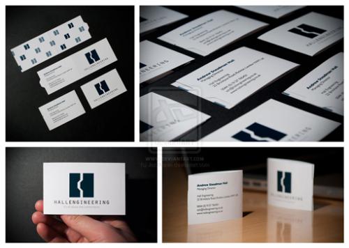
For this one, the fold causes the card to stand upright, and the locking mechanism actually mirrors the company logo. Perfect for an engineering company.
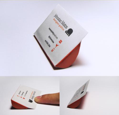
I love the idea of a business card that won’t fall down. It definitely won’t fit into your wallet, but it’ll make a great desktop conversation piece.
The illustration here is just beautiful and it is really brought to life by the pop-up nature of the card’s design.
This is one of my favorite’s on the list. It’s probably not very cheap, but it’s such a classy take on a business card design!
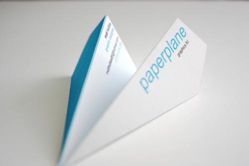
Fantastic design. I’m sure everyone who gets it can’t wait to throw it to see if it really flies. I hope it does.
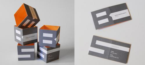
More cubes! This one is a little more thought through. Notice how the sides of the cube make up the guy’s initials.
This is the last and best cube on the list. It starts flat and pops up into a box with a top and bottom, which is far more impressive than having three simple folds like the others.
This one is a greeting card and business card all rolled into one. Again we see the idea of a desktop decoration that you might actually want to keep around, which is a great goal to have for your business card.
Wrap Around
The next category of cards all have a design that wraps around from the front to the back so that when two cards are placed together, the full picture is seen. Sometimes the design bleed is large and obvious, other times it’s just a tiny piece that you can easily miss if you’re not looking.
My thought about these is that your effort will probably go unnoticed for the most part. Most of the time you give one person one card, so you’re the only one who can ever put two together. However, I can see some people liking the hidden gem aspect in that idea.
Fun to Play With
There’s definitely something to say about designing a business card that people can play with. It creates a connection and value to the object and makes the receiver much more likely to show it around, thereby giving you free advertising. The cards and concepts below are great examples of this idea.
This one is only a concept but it’s definitely a funny idea that someone needs to work into a real card. I see a large market for finger puppet business cards!
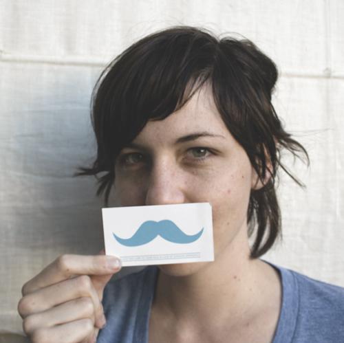
This one is great because it’s actually super cheap. The card is one color, uses minimal ink and doesn’t have to have any special materials, folds or cuts. I’ll wager that most people won’t be able to resist sneaking it up to their lip for a quick dose of mustache mischief.
DJs need business cards and you pretty much can top one that is a turntable! As you spin the record, different information is revealed.
This one is a fully-functional sliding caliper! If someone gave me this I would definitely keep in in my desk for quick-measuring and would constantly be reminded of their business.
Useful
Adding in some practical functionality to your card serves the same purpose as making it fun to play with. The more value someone sees in it, the less likely it is to end up in the recycling can.
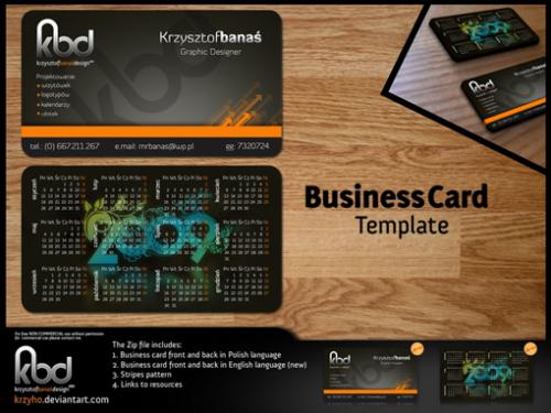
You don’t have to be the most creative person in the world to create a practical business card. This person threw a quick one year calendar on their card. This is really handy to have in your wallet and is a great way to help ensure the person carries your card around for at least a year!
I really love this idea, it’s word of mouth marketing at its finest. The basic concept is that every business card you give out has a little portion that can be torn off and shared with someone else. It’s a great way to encourage your customers to recommend you!
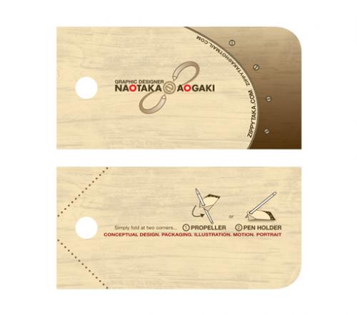
I think they might be stretching a little bit with the pen holder, but who knows, it might just work! The propellor aspect could’ve easily placed this one in the “fun” category.
Die Cut
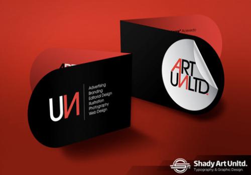
Plain business cards are boring! One of the most common ways to spice them up is to have a special shape that is all your own. This is a great way to grab the attention of the person you hand the card to.
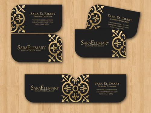
This is a simple idea with a really attractive execution. By rounding off two of the corners, the card takes the shape of a drinking glass and the graphics really bring it to life.
This person said they wanted round business cards, but realized that doing so meant that the cards wouldn’t fit into a typical cardholder. The solution? A perforation that allows you to rip the card so it will fit.
This one is a good combination of a special cut and clever design. The jagged edge combined with the graphics make it look like the card was burned, perfect for a company called “Howl Fire.”
Animal lovers are sure to hate this one but as a BBQ lover it sure made me laugh! The card is in the shape of a casket and clearly depicts the types of dead animal that you can expect to see on the menu. You have to appreciate a company who really embraces the dark side of what they do!
If you can’t figure out how to make a card fold up into a 3D throwing star like the previous one we saw, why not just go the die-cut route? This one might be even better for throwing!
This one could read a better if the graphics were tweaked, but I love the idea. The cut at the top of the card is in the shape of a uvula, that little thing at the back of your throat. Given that the card is for a speech therapist, it works.
The artwork on this one tricks your eyes into seeing a 3D element, but in reality it’s meant to be a flat card with a clever die cut.
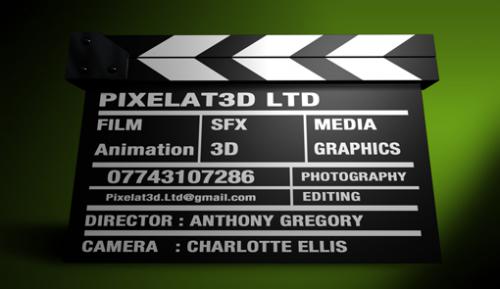
The designer here is a 3D artist. One side of his card shows the wireframe of a gun like you’d see in a 3D modeling program. The other side shows the finished product.
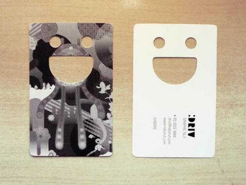
The smiley is more than a smiley, it’s also the “D” from the company name.
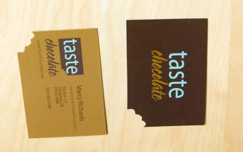
Any business with the words “taste” and “chocolate” in its name should definitely have a bite taken out of their cards!
Playing Card Designs
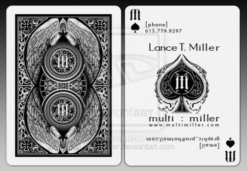
Another popular trend that I noticed was basing your card design on playing cards. The idea here is that you’ll get more attention because you’ve mimicked another real-world object that people are familiar with. They don’t expect your business card to look like a playing card so they are hopefully more impressed with the thought you put into it.
All of the cards in this category are conceptually the same, but the third is my favorite implementation of the bunch.
Love That Design
These cards don’t have anything 3D or die cut, they just have a clever graphic on them. Each represents a marketing piece that is sure to fetch a few smiles.
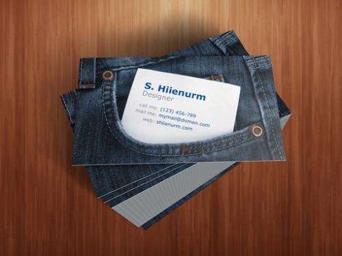
This one is great. The card is actually printed on the card! I love the graphic of the jean pocket, it feels cool in a 1990s sort of way.
The headline “Creativity Sells” is perfect with the image of the pencil barcode and it’s a decent appeal for a designer to make to his/her clients.
This one is my favorite in this category. From a certain angle, the card simply says “Hi.” When you get closer though you realize the company name is “Hidden Creative.” A great optical illusion!
Novel
The cards in this last section are just quirky. They all have an element of surprise to them and definitely aren’t what you expect when someone hands you a business card.
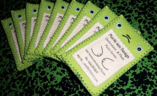
Nothing says “personal” like a handmade fuzzy bear card! I’m not sure I would hand out one with my name on it, but it sure scores high in “cuteness.”
The next time I order business cards, I absolutely want them to glow in the dark!
These are another take on the hand-made idea of the first card. I guess the fuzzy animal business card market must be on the rise!
The idea here is to make your business card look like money. That way you can just leave them lying around and watch as people go out of their way to pick them up! They’ll either laugh at your cleverness or hate you.
Scratch that, I don’t want a glow in the dark business card, a heat-activated color changing card is even cooler! If you know of a printer that can actually make these, let me know in the comments!
Thoughts on Practicality
Whenever I do a post on over-the-top marketing examples, inevitably, several people respond that such practices are so rare as to be useless for inspiration. Honestly, I couldn’t disagree more.
If you’re a freelancer with small clients, it might genuinely be the case that you’ll never be able to sell them on business cards that cost more than their typical advertising budget for the year. However, there are plenty of large, well off businesses that can and do engage in these types of grand purchases. If your business wants to really stand out at an expo where everyone is exchanging business cards, what better way is there to accomplish this than to hand them something so cool they don’t want to throw it away?
Further, even if your clients aren’t able to cough up the dough for custom, die-cut metallic folding cards, you should still be able to glean tons of inspiration from this post. By looking at the grandest cards around, you might just get an idea of how to achieve a similar impact on a modest budget. Some of the cards above haven’t ever made it out of Photoshop, but they can still achieve that same purpose of giving you an amazing idea of your own.
So if you skimmed through these with a strictly skeptical viewpoint, I encourage you to take another look with an open mind. You might just be surprised at how much you benefit from a little over-the-top thinking!
Conclusion
I hope the cards above are enough to kick your brain into high gear and help you create your own fantastically clever business card. If you have any card designs that you’re particularly proud of, leave a comment with a link below. Explain your idea and why you think it’ll hold the receiver’s attention more than a typical card.


