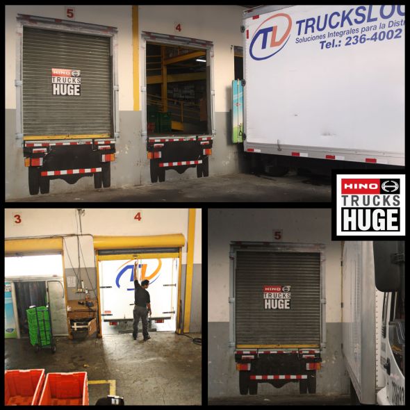
怎样让你的卡车显得比其他人的都大?
Hino大卡粉刷了码头仓库的库门,让它看上去就是一辆Hino 的尾巴。每当有货车到此卸货,看上去就是钻进了一辆Hino卡车里——谁大谁小,还用说吗!
这种“战略上藐视敌人”、直接拉开“辈分”的思维,竞争广告颇可借鉴。
We took advantage of our loading dock (cargo bay) doors, and with the aid of our outdoor made them look like the back of a Hino Truck. At the moment in which delivery trucks arrived with merchandise, it gave the ilusion that they were depositing thier deliveries into a Hino Truck.
Advertising Agency: P4 Ogilvy & Mather, Panama
Chief Creative Officer: Pinky Mon
Director Creative: Jonathan Lasso
Copywriters: Humberto Alvarado, Dennis Icaza
Art Directors: Roberto Perez, Edmar Quiros
Executive Producer: Raynier Villalobos
Account Manager: Liseth Fong
Photographer: Abdel Perez
Print Producer: A.S Graphics


