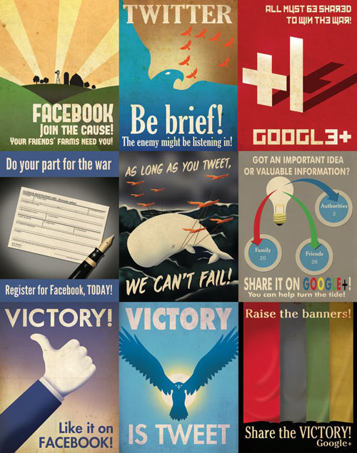
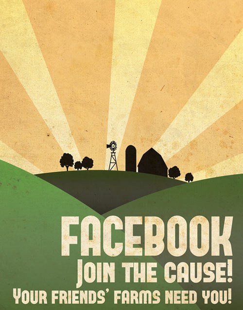
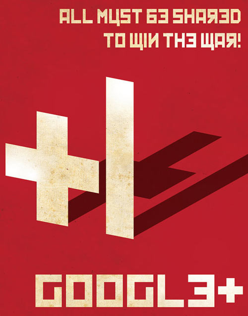
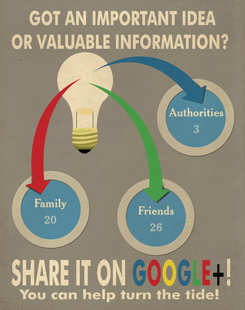
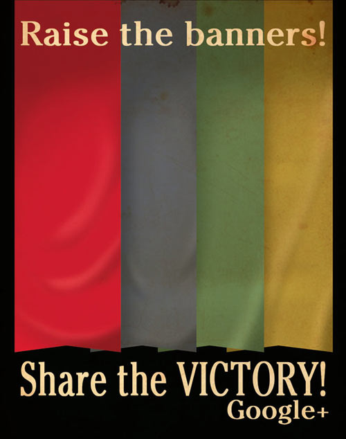
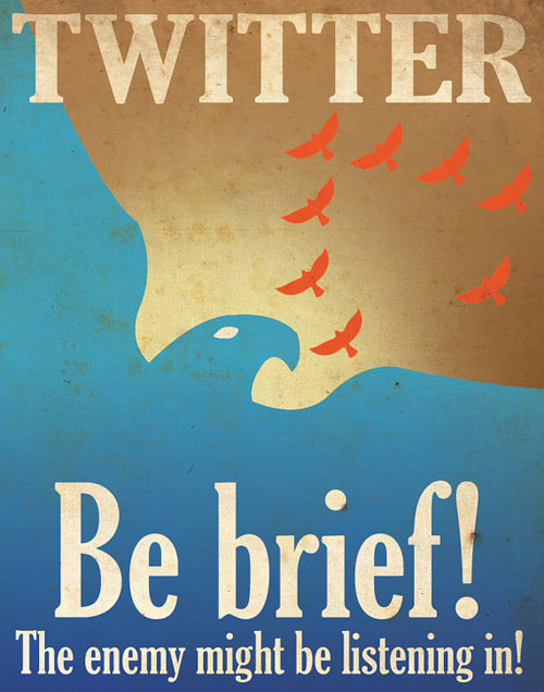
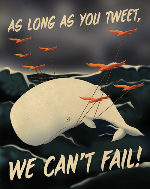
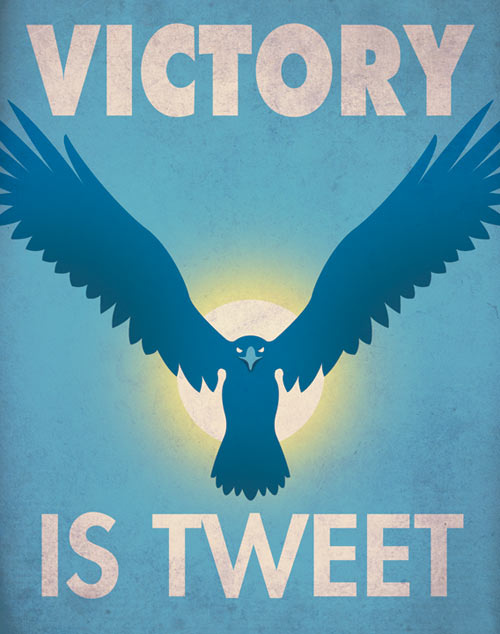
当网际网络出现社群网络一直都是我们的话题,这里为大家介绍三个家喻户晓的面子书,推特和谷歌+1的复古海报。很奇怪的融合,带出的效果很不一样,就是现在最夯的科技网络和复古的普普风感觉就像在西餐厅叫云吞面(被飞鞋)。
这几幅图是由Aaron Wood一个美国的设计师所设计,他将这3大美国最普遍的社群网络为话题设计一系列充滿复古味的海报。如果看过早前的革命宣传海报,大概就是那个感觉,简单色彩的搭配和没有太花俏的插图。
There are always topic for social networking since we have internet, I will introduce three well known which are Facebook, Twitter and Google +1 retro posters. It is a rare mixture with the most high-end technology and retro pop style is like eating char keow teow in a western restaurant.
American graphic designer Aaron Wood designed a series of poster, starring US 3 most widely using internet community into a traditional fashioned series of posters. If you have seen the revolution posters before, it is probably that kind of feeling with a simple mix of colors and not too fancy illustrations.


via imenzu


